Conductor View
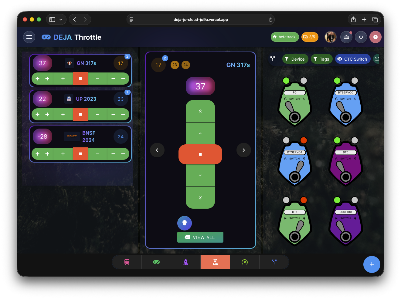
The Conductor View (/conductor) is a comprehensive control interface that places the throttle list, a full-featured active throttle, and the turnout panel side by side in a single screen. It is designed for operators using large monitors, tablets in landscape mode, or dedicated dispatching stations where everything needs to be visible at once.
Three-Pane Layout
The Conductor View uses a CSS Grid with three columns that appear when the container width reaches 960px or wider (using container queries with @[960px]:grid-cols-3).
Left Pane: Throttle List
The left pane displays the same ThrottleList component used on the standalone Throttle List page. All active throttles appear as tiles with speed displays, locomotive names, avatars, and horizontal button controls.
This pane has:
- A green border accent (semi-transparent) to distinguish it visually.
- Independent vertical scrolling, so you can scroll through many active throttles without affecting the other panes.
- The same drag-to-reorder functionality and FAB (+) button for adding locomotives from the roster.
Center Pane: Active Throttle
The center pane is the primary control area. It contains a Vuetify carousel that cycles through all active throttles. Each carousel slide renders a SimpleThrottle component, which provides:
- Locomotive avatar with context menu (Stop, Park actions).
- Mini consist indicator showing linked units.
- Locomotive name in gradient text.
- Current speed display as a glowing pill badge.
- Button controls in a vertical stack (double-up, up, stop, down, double-down) for precise speed adjustment.
- Function speed dial for toggling decoder functions (F0--F28) via a radial menu.
Use the carousel's left/right navigation arrows to switch between locomotives. The carousel fills the available height (minimum 90vh) to give each throttle generous screen space.
Right Pane: Turnouts
The right pane embeds the TurnoutList component from @repo/ui, showing all turnouts configured for the current layout. Each turnout displays its name and a throw/close toggle. See Turnouts for details on turnout controls.
This pane also scrolls independently, which is useful when your layout has many turnouts.
Responsive Behavior
The three-pane grid is driven by CSS container queries, not viewport media queries. This means the layout adapts based on the actual width of the Conductor View container:
- 960px and wider -- all three panes display in a three-column grid. The grid height is calculated to fill the viewport minus the app header and footer (
calc(100vh - var(--v-layout-bottom) - var(--v-layout-top))), creating a fixed-height dispatcher station feel. - Below 960px -- the panes stack into a single column. The order changes so that the active throttle (center pane) appears first, followed by the throttle list, and then turnouts. This reordering ensures the most important control (the active throttle) is always at the top on smaller screens.
When to Use the Conductor View
The Conductor View is ideal for:
- Dedicated dispatching stations at a club layout where one operator manages multiple trains and turnout routing from a single screen.
- Large tablets or monitors where you want to see everything without switching between pages.
- Operating sessions where fast access to throttle switching and turnout control reduces the time spent navigating between separate views.
For quick single-train operation on a phone, the standard Throttle Control or Throttle List views are better suited to the smaller screen.
Route Guards
The Conductor View requires all three route guards: requireAuth, requireDccEx, and requireLayout. You must be signed in, have a DCC-EX connection available, and have a layout selected before this page is accessible.